Art Direction · Brand Design
As the lead Art Director on the City of Regina’s brand refresh, I was responsible for modernizing the city’s visual identity and developing a comprehensive set of brand guidelines to ensure consistency across all communications. The project included refining and simplifying the existing logo, updating the colour palette, and creating a 133-page brand guidelines document that established a clear, flexible framework for future use.
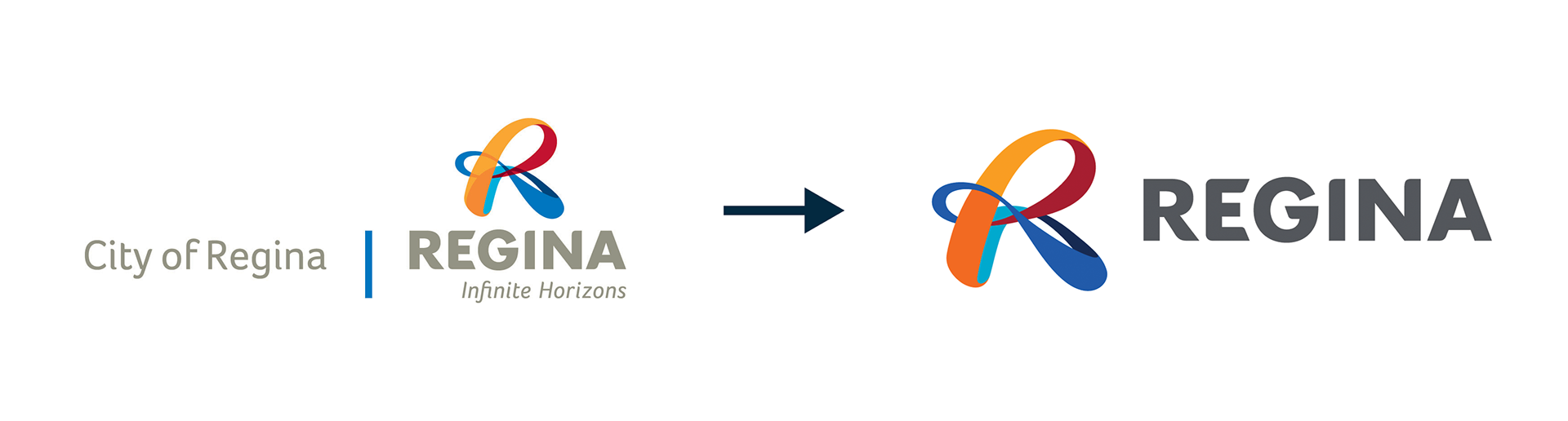
The project began with a deep audit of the existing brand assets and stakeholder feedback to identify pain points in usability and consistency. The main challenge was balancing modernization with brand recognition – simplifying the logo and color system without losing its established identity. Through iterative design exploration and close collaboration with the lead copywriter and creative director, I refined the logo by removing unnecessary graphic elements, optimizing proportions, and standardizing colour usage.
Developing the brand guidelines required close attention to detail and coordination across departments to ensure every aspect, from typography, tone of voice, graphic elements, and photography styles, aligned with the refreshed vision. By maintaining open communication and a structured design process, I delivered a system that is both accessible and adaptable, empowering internal teams at the City of Regina to maintain a cohesive and professional visual presence across all platforms.
Deliverables include:
Updated logo files (including all colour and layout variations)
133-page brand guidelines document
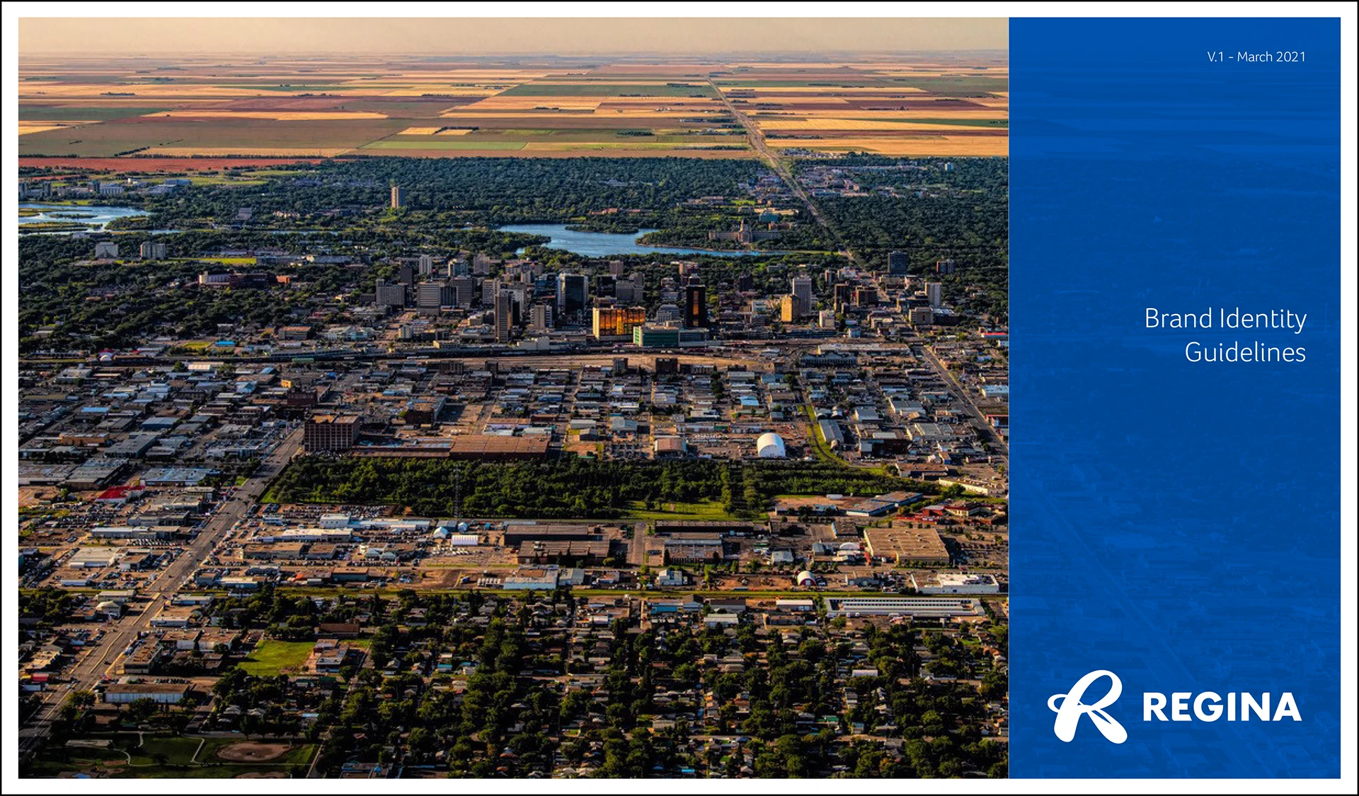
Brand Identity Guidelines
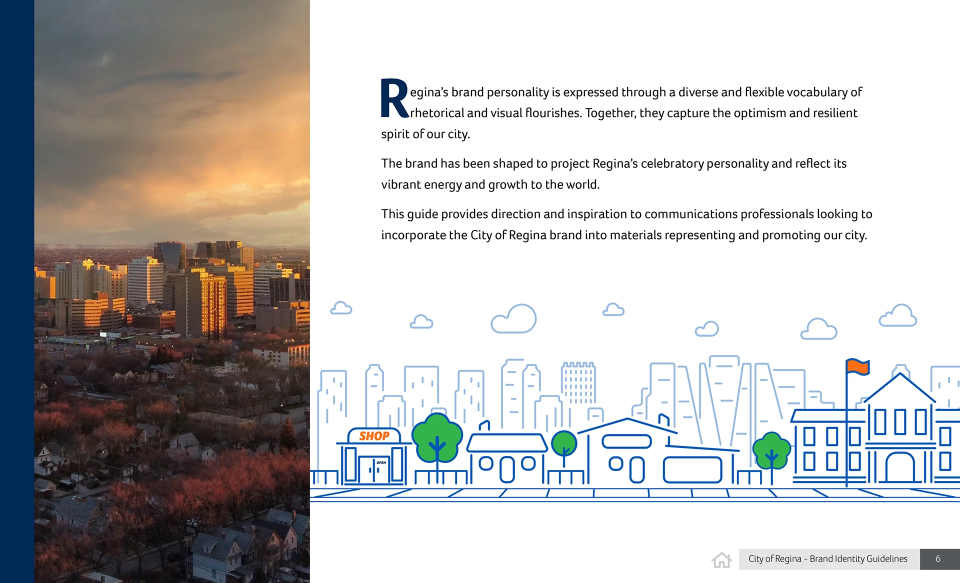
Brand Personality
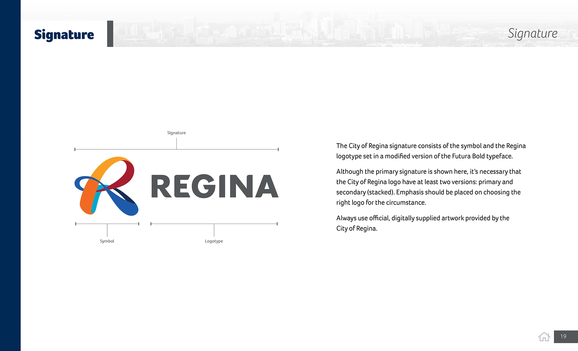
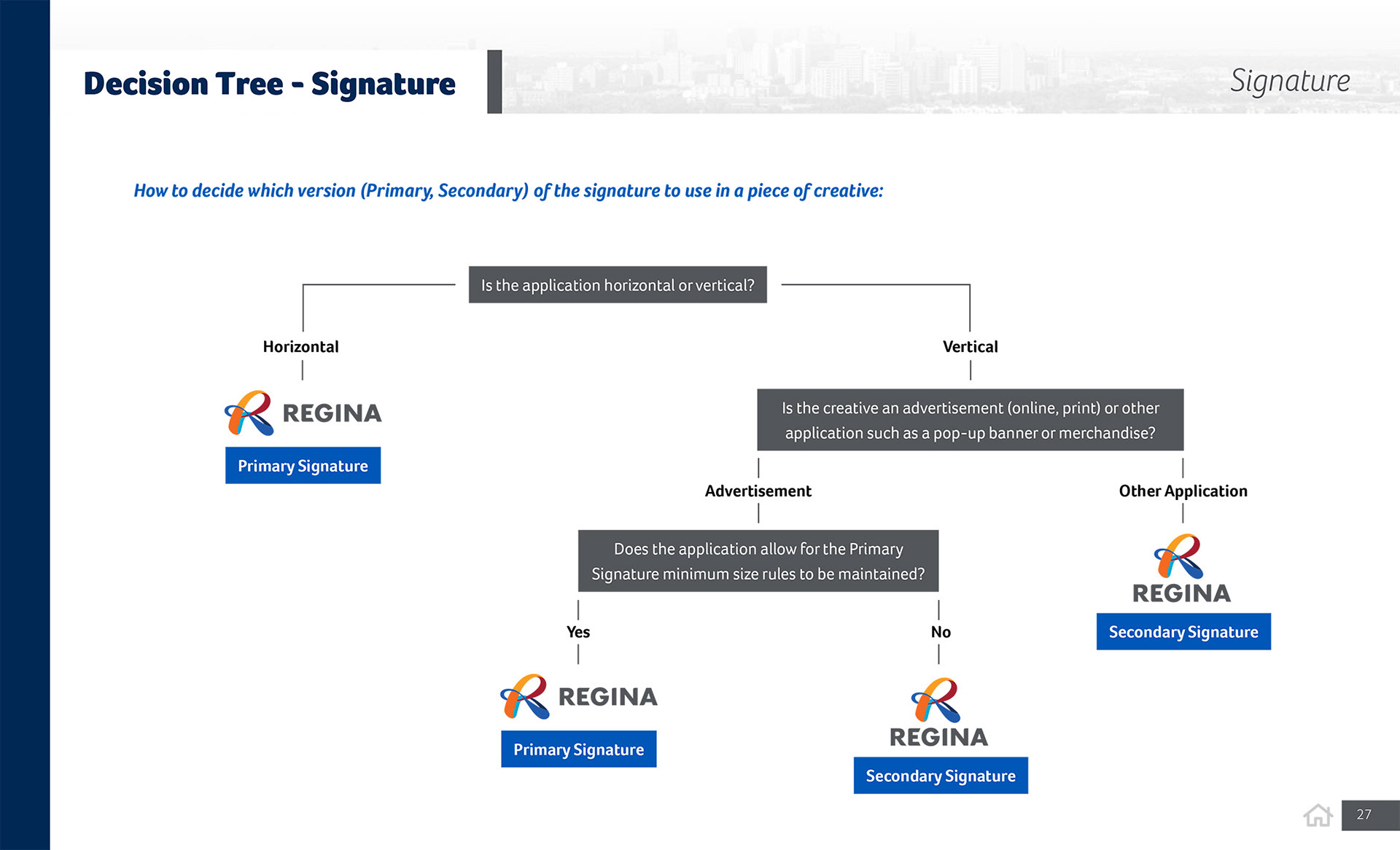
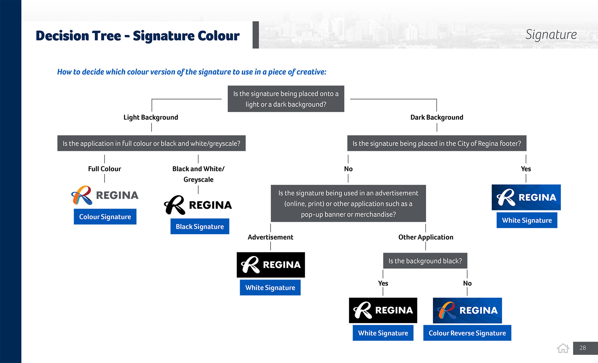
Brand Signature
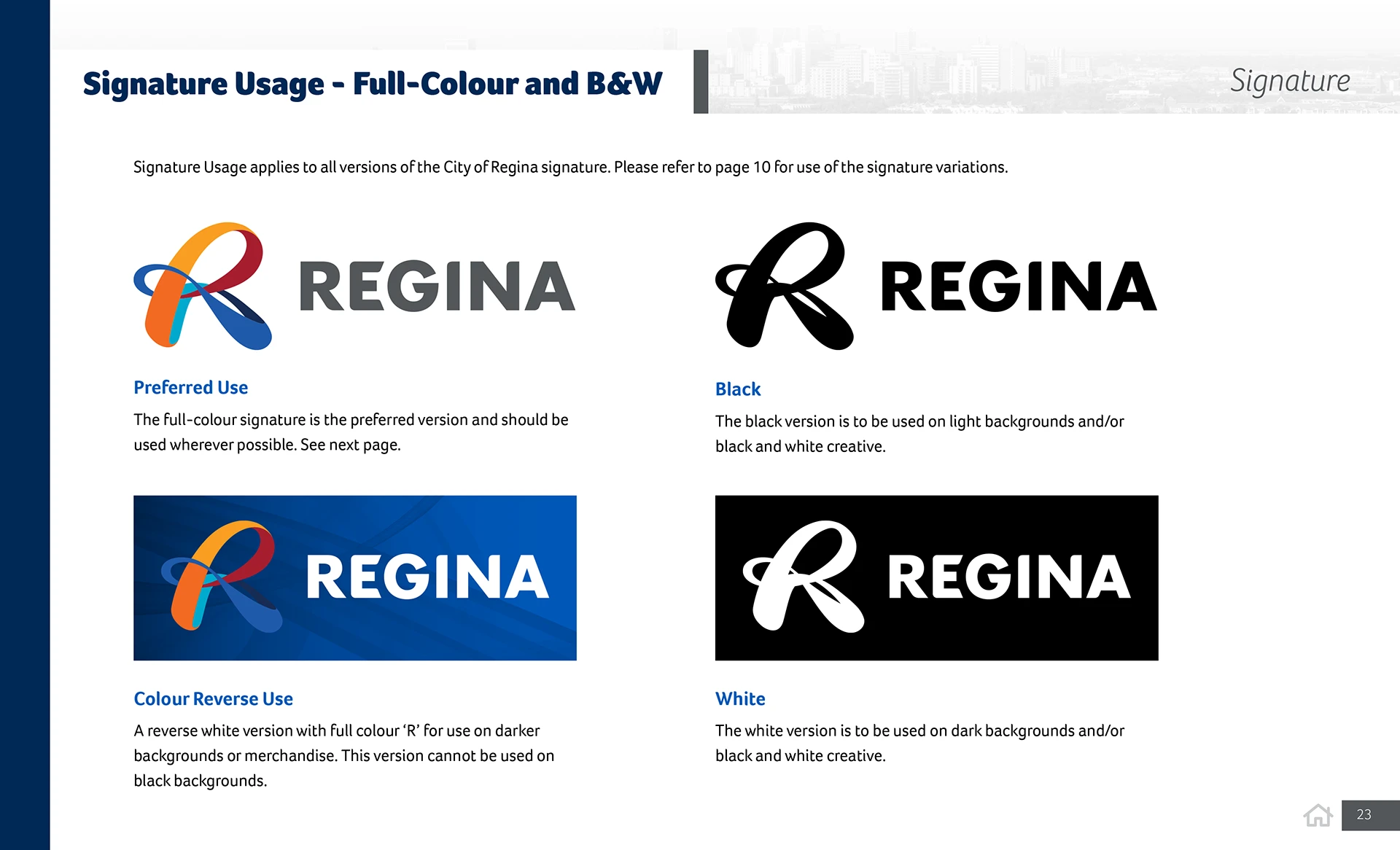
Brand Signature Usage