Art Direction · Graphic Design · Creative Project Management
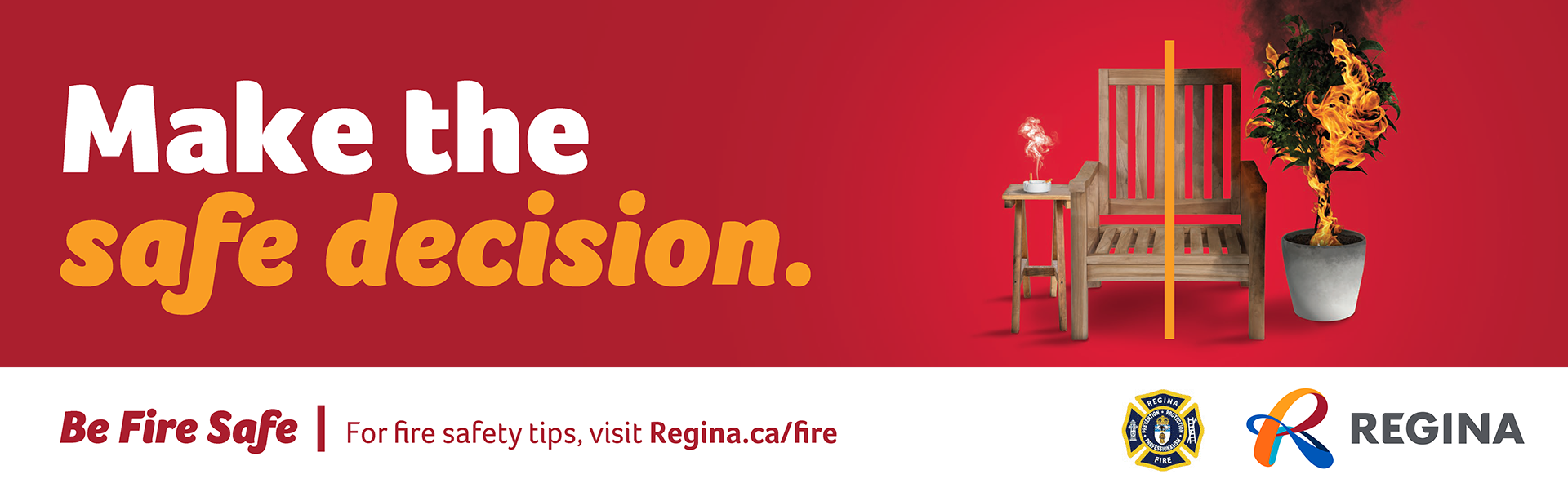
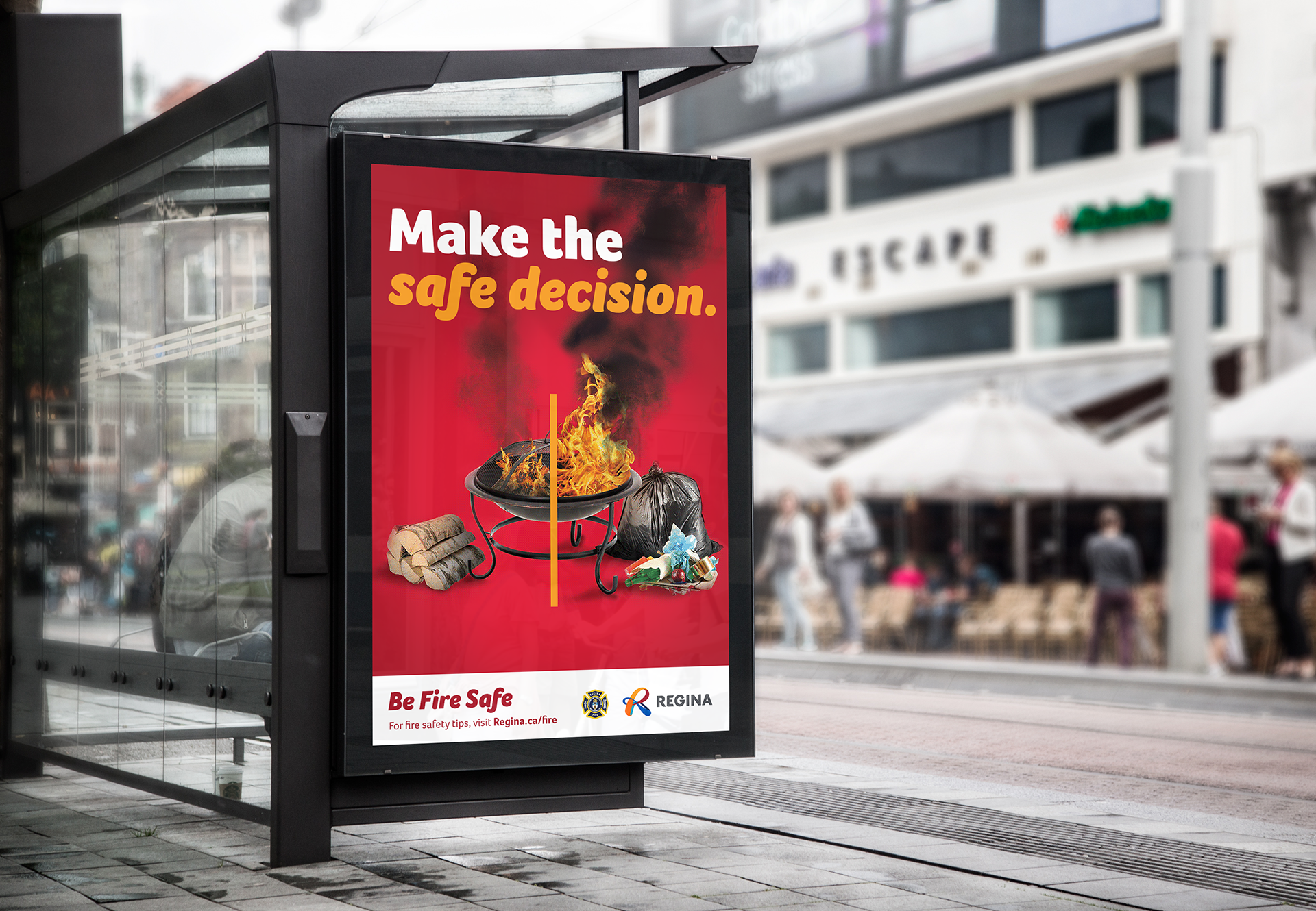
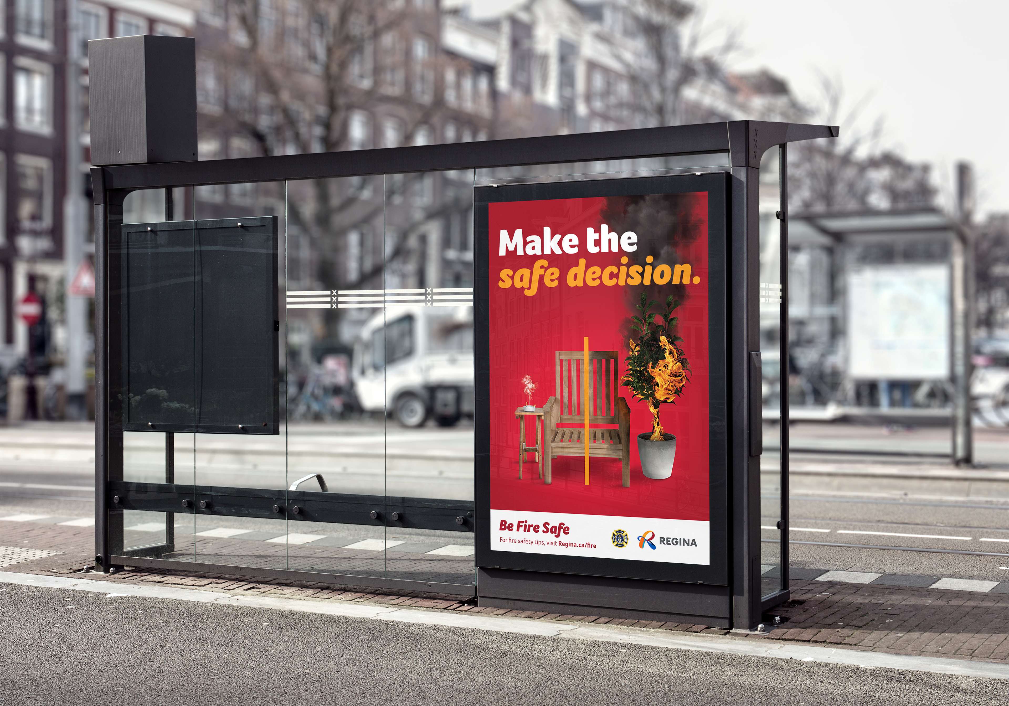
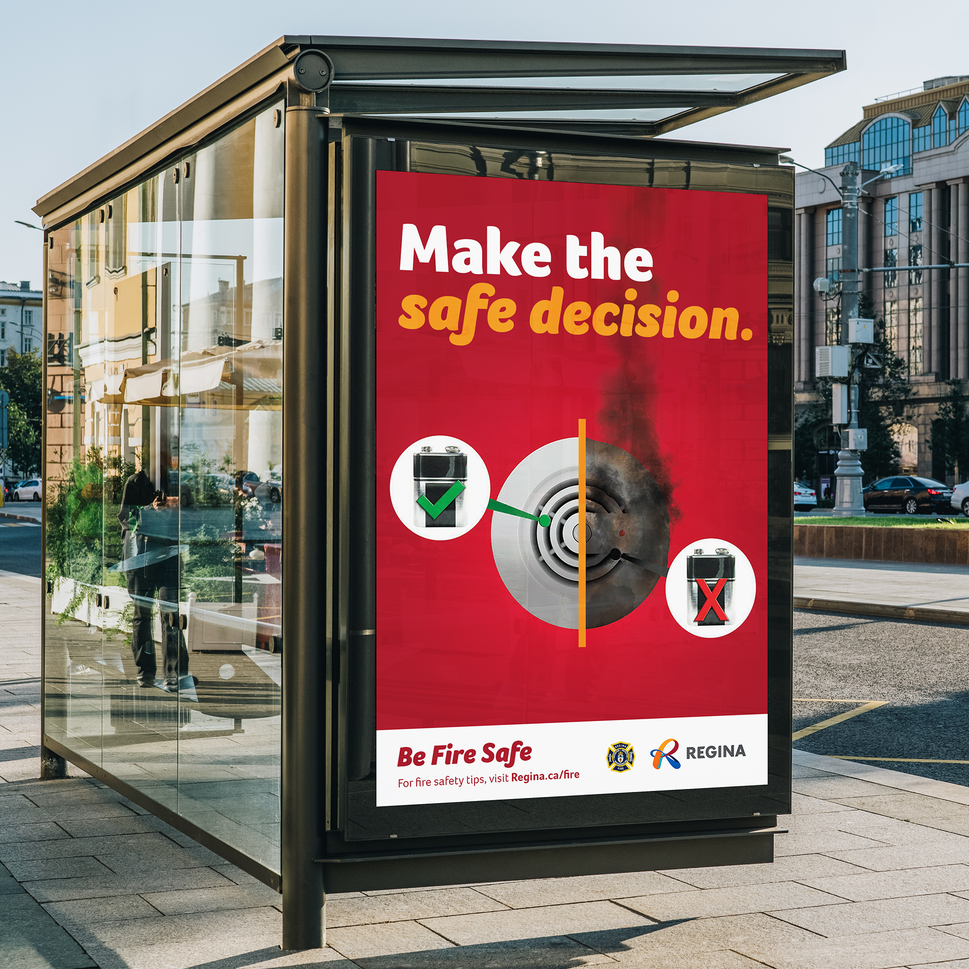
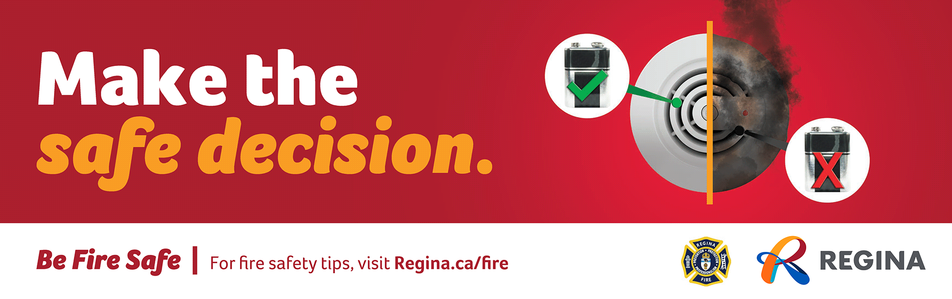
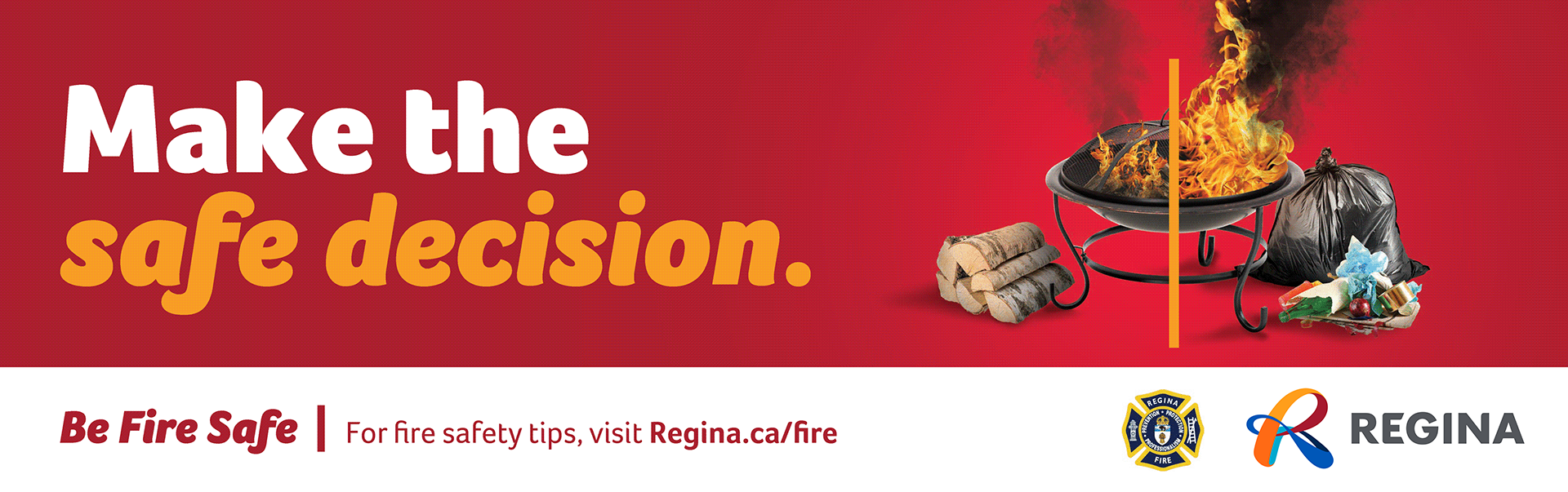
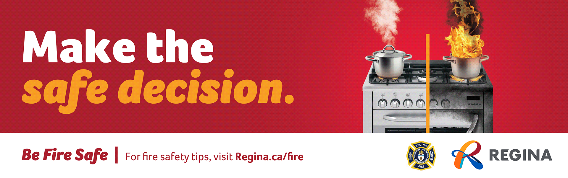
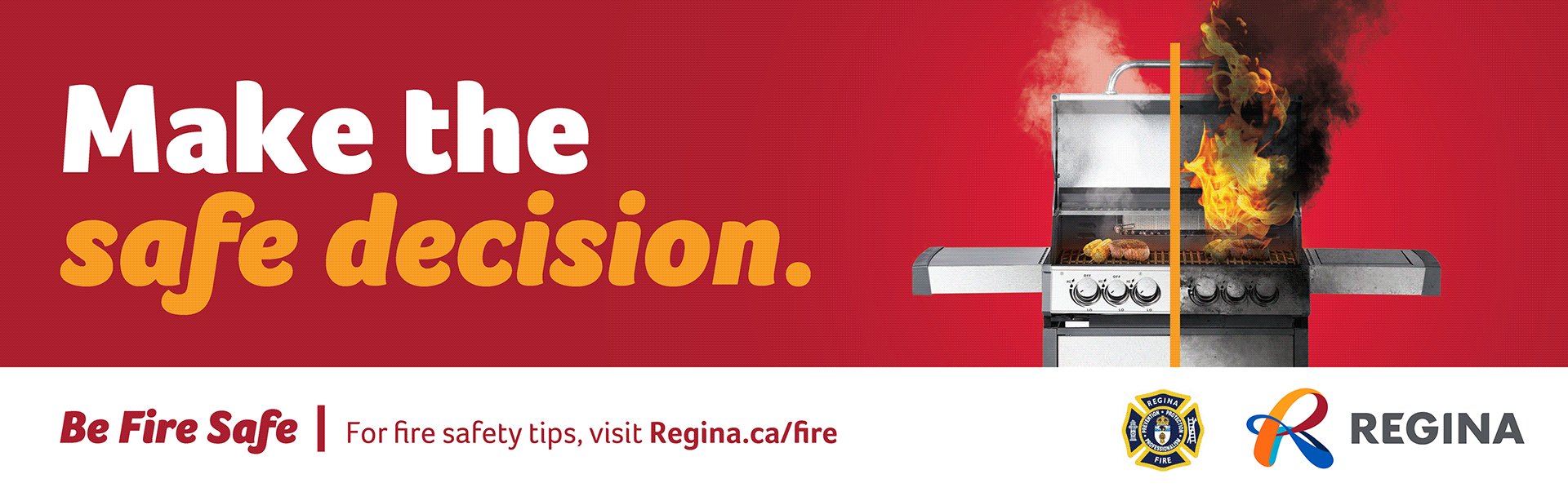
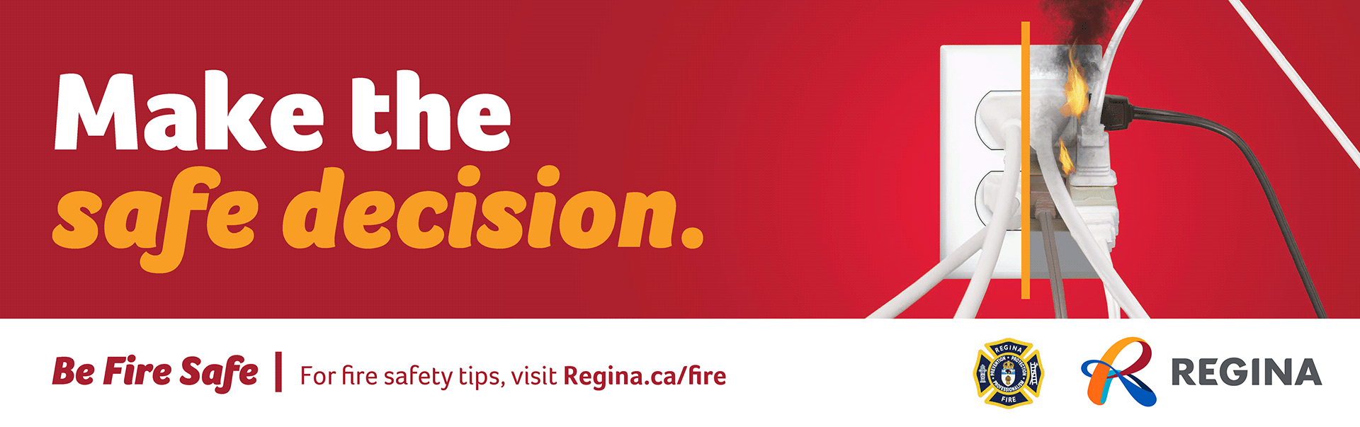
This campaign was developed by the City of Regina to promote safe fire practices within the community, with a particular focus on reaching newcomers and lower-income residents through transit advertising. As the Art Director, my role was to take the approved creative concept and develop all final production files for both transit interior posters and shelter posters. Each ad used a split-image approach with the left side showing the safe version of a fire-related activity, and the right side depicting an unsafe or prohibited version. This created an immediate and visually clear contrast to effectively communicate the message.

One of the main challenges was adapting a single campaign concept across multiple ad formats while ensuring the visual message remained clear and consistent at different scales and viewing distances. The split-image design required precise photo editing and composition to ensure both sides balanced visually while reinforcing the core message of safety versus risk.
I also needed to manage image resolution and color consistency between print formats, accounting for variations in material and lighting across transit interiors and shelters. By working closely with the marketing and communications team, I fine-tuned layouts, adjusted contrast and typography for readability, and ensured all final production files met print specifications. This careful attention to technical detail and message clarity helped deliver a strong, easily understood campaign that effectively reached its target audience across the city’s transit network.
Deliverables include:
Print-ready transit interior and shelter posters
Bus shelter
Bus shelter
Bus shelter
Bus interior
Bus interior
Bus interior
Bus interior
Bus interior